Description of the data collection process here.
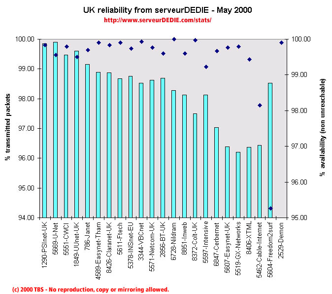 Our reliability graphic displays the percentage of packet loss on the left axis (cyan bars) i.e. 100 - packet loss %. On the right axis (blue points) we display the availability percentage i.e. 100 - unreachable % (unreachable result is attained when none of the 15 probe packets are returned). Therefore the longer the bars and the upper the points, the better.
Little performance decrease in May! We note the increase ok UUnet-UK after last month's loss, Ftech and Cable-Internet.
Performance loss for Nildram, Colt-UK, Easynet-UK, GX-Networks, and Freedom2surf (they had a high score in April but in May we measured unavailability problems).
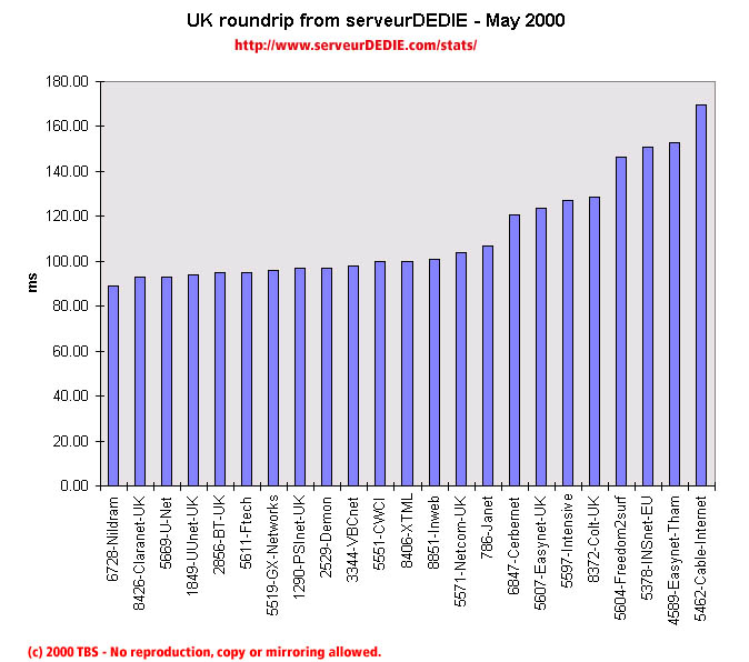 Our roundrip graphic displays the mean roundtrip time in milli-seconds. This graphic should not be read and analysed alone but with the availability chart above. Alone this chart does not mean much.
Nothing special.