Description of the data collection process here.
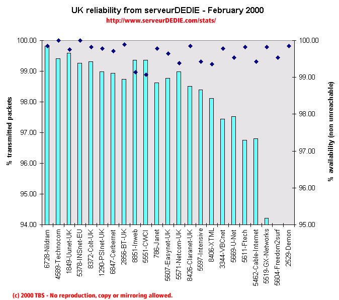 Our reliability graphic displays the percentage of packet loss on the left axis (cyan bars) i.e. 100 - packet loss %. On the right axis (blue points) we display the availability percentage i.e. 100 - unreachable % (unreachable result is attained when none of the 15 probe packets are returned). Therefore the longer the bars and the upper the points, the better.
February 2000 was a bit better that the previous month, but only sligtly. Demon gets a really bad score and that drives the average down. We also see a performance decrease for Ftech, VBCnet, U-net and GX-Networks.
On the good side of things, Colt and PSInet come back to normal performances after last month's special events. Intensive and INSnet's performances increase too.
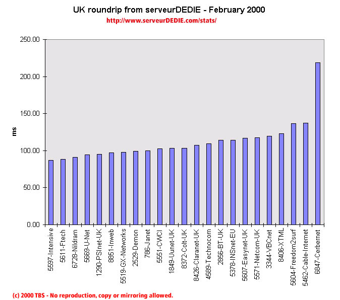 Our roundrip graphic displays the mean roundtrip time in milli-seconds. This graphic should not be read and analysed alone but with the availability chart above. Alone this chart does not mean much.
Nothing special.