Description of the data collection process here.
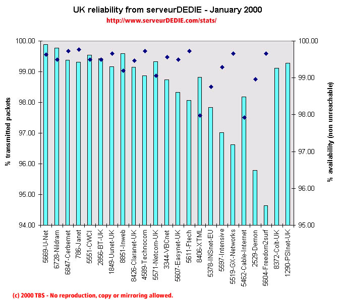 Our reliability graphic displays the percentage of packet loss on the left axis (cyan bars) i.e. 100 - packet loss %. On the right axis (blue points) we display the availability percentage i.e. 100 - unreachable % (unreachable result is attained when none of the 15 probe packets are returned). Therefore the longer the bars and the upper the points, the better.
January 2000 was not as good as December 1999. CWCI, Inweb and INSnet-EU which decreased in December increased in January, back to more normal performance. Ftech also increased its score. Performance decreased was measured for VBCnet, Easynet-UK, Intensive and Demon. A special note for PSInet-UK which sees its score decrease importantly because of an important unavailability outage. This might have been caused by a problem on the sampled box, if so, those boxes ought to be monitored more closely.
Colt-UK experienced a DOS attack on their nameserver, which explains the bad availability measured this month.
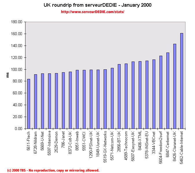 Our roundrip graphic displays the mean roundtrip time in milli-seconds. This graphic should not be read and analysed alone but with the availability chart above. Alone this chart does not mean much.
Nothing special.