Description of the data collection process here.
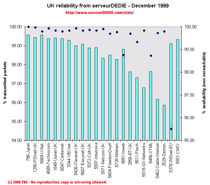 Our reliability graphic displays the percentage of packet loss on the left axis (cyan bars) i.e. 100 - packet loss %. On the right axis (blue points) we display the availability percentage i.e. 100 - unreachable % (unreachable result is attained when none of the 15 probe packets are returned). Therefore the longer the bars and the upper the points, the better.
December was a good month. We measured performance increase for almost evey operator, excepted Inweb, INSnet (AS5378, still allot of unreachables) and Cable & Wireless (AS5551). Other than that, we must mention the excellent performance of Janet and the performance increase of PSInet-UK, Cerbernet, VBCnet, Easynet-UK and Ftech. We also measured Demon with increased performance, but overall it still a rather poor score.
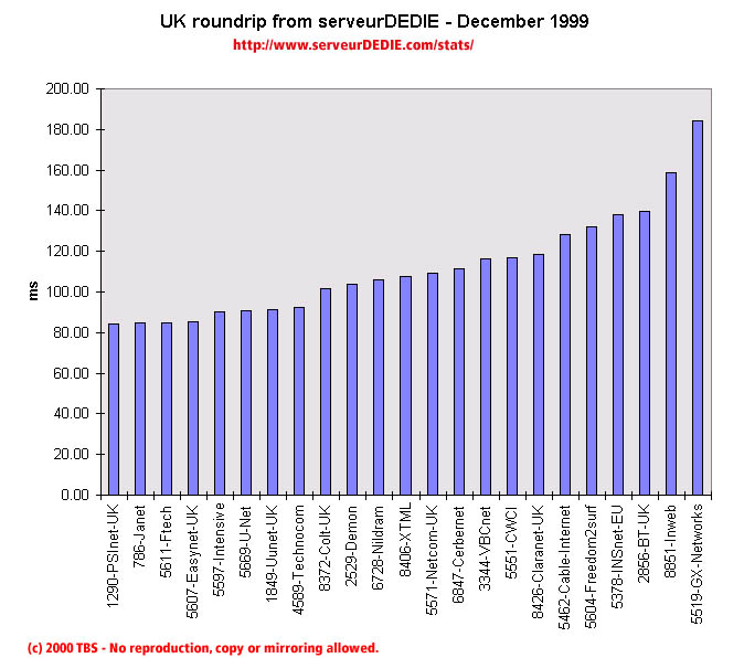 Our roundrip graphic displays the mean roundtrip time in milli-seconds. This graphic should not be read and analysed alone but with the availability chart above. Alone this chart does not mean much.
Nothing special.