Description of the data collection process here.
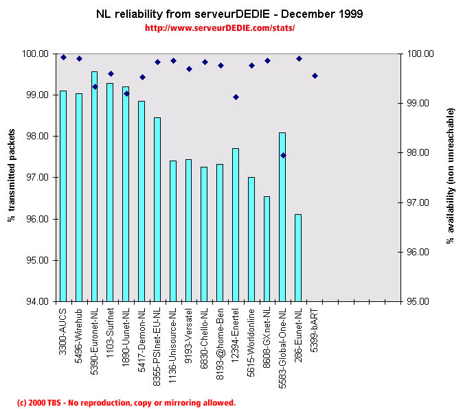 Our reliability graphic displays the percentage of packet loss on the left axis (cyan bars) i.e. 100 - packet loss %. On the right axis (blue points) we display the availability percentage i.e. 100 - unreachable % (unreachable result is attained when none of the 15 probe packets are returned). Therefore the longer the bars and the upper the points, the better.
Good results in December for NL! Only one counter performance for Enertel. Otherwise we notice a performance enhancement for AUCS, Wirehub, Unisource, Chello-NL, Worldonline, Global-One-NL, EUnet-NL and bART! It seems at first that the performance of EUnet backbone has consequences on many NL operators. We will see if this theory is true in the few next months.
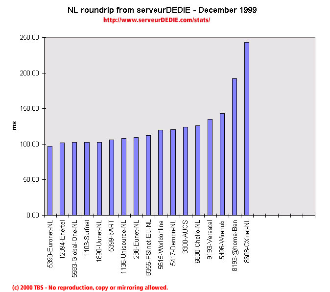 Our roundrip graphic displays the mean roundtrip time in milli-seconds. This graphic should not be read and analysed alone but with the availability chart above. Alone this chart does not mean much.
Nothing special.