Description of the data collection process here.
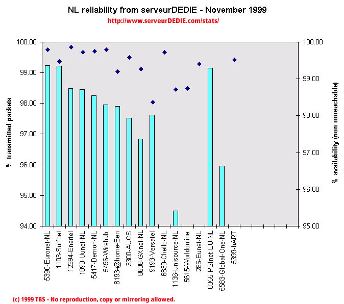 Our reliability graphic displays the percentage of packet loss on the left axis (cyan bars) i.e. 100 - packet loss %. On the right axis (blue points) we display the availability percentage i.e. 100 - unreachable % (unreachable result is attained when none of the 15 probe packets are returned). Therefore the longer the bars and the upper the points, the better.
The November results are lower than those of October mainly because of a few very bad measurements. Among those bad measurements we count PSInet-EU (see below), Global-One (allot of unreachables) and bART (very high packet loss). There are other less important performance decrease but still very significant, especially Eunet-NL's. This decrease has consequences for other operators, in NL and in other countries. Among those operators, Unisource-NL, and Worldonline. This kind of score does not surprise us that much, as we have been measuring low performance for EUnet-FR for over a year. This leads us to think that there is a real problem with EUnet.
As in most other European countries measured, PSInet-EU gets a bad score with an excessive amount of unreachability (despite very good rate of transmitted packets). As you will notice, we consider that it is useless to have low packet loss if availability is low too in our measurements.
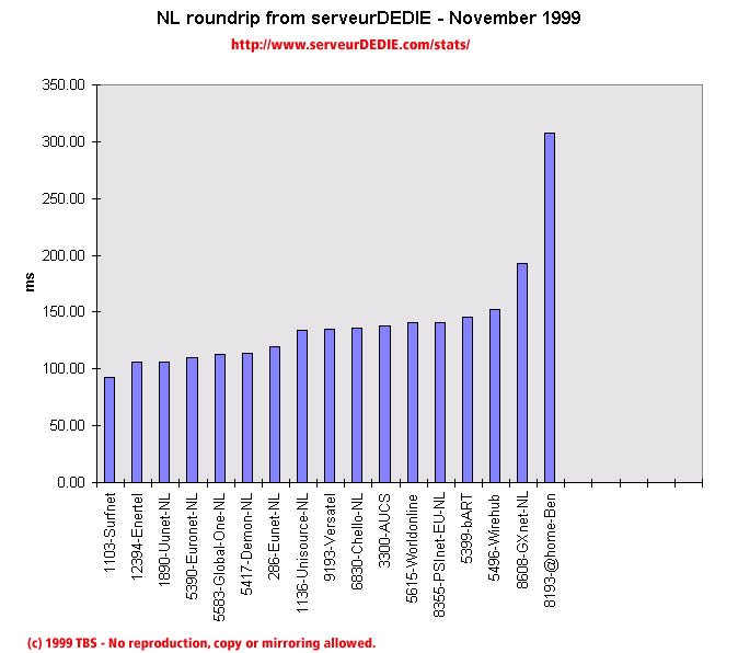 Our roundrip graphic displays the mean roundtrip time in milli-seconds. This graphic should not be read and analysed alone but with the availability chart above. Alone this chart does not mean much.
Nothing special to comment on.