Description of the data collection process here.
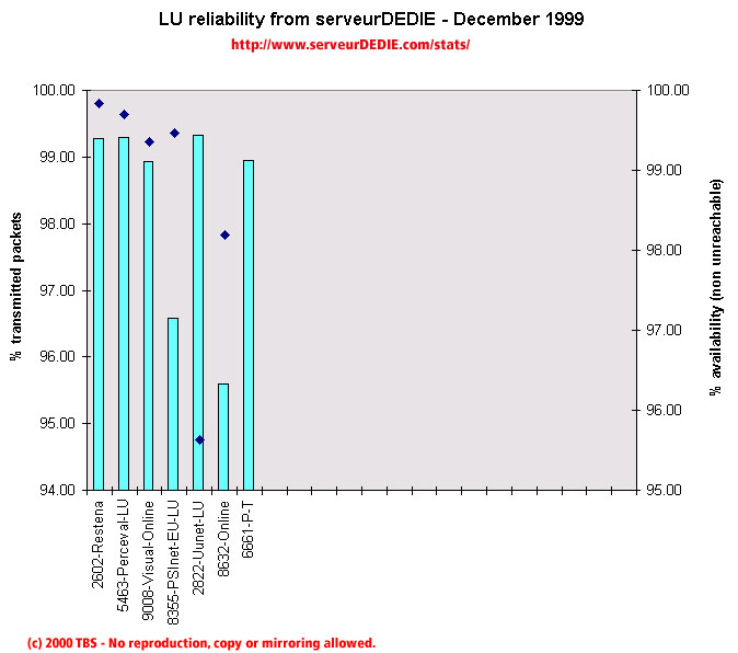 Our reliability graphic displays the percentage of packet loss on the left axis (cyan bars) i.e. 100 - packet loss %. On the right axis (blue points) we display the availability percentage i.e. 100 - unreachable % (unreachable result is attained when none of the 15 probe packets are returned). Therefore the longer the bars and the upper the points, the better.
The December results are better than the November ones. We noted that the Online performance increased but is still low, that PSInet-EU gets a normal score. On the other hand UUnet-LU gets a bad note because of unavailability: it seems that the server (a primary DNS server) was switched off or had a breakdown.
We measured awful availability problems to P-T. This causes the operator to have a very bad score although when the network is available, it works properly.
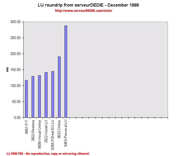 Our roundrip graphic displays the mean roundtrip time in milli-seconds. This graphic should not be read and analysed alone but with the availability chart above. Alone this chart does not mean much.
Nothing special to comment on.