Description of the data collection process here.
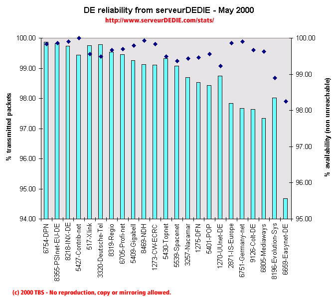 Our reliability graphic displays the percentage of packet loss on the left axis (cyan bars) i.e. 100 - packet loss %. On the right axis (blue points) we display the availability percentage i.e. 100 - unreachable % (unreachable result is attained when none of the 15 probe packets are returned). Therefore the longer the bars and the upper the points, the better.
Global performance decreased slightly in May, nothing bad though. The main losses are from Spacenet, IS-Europe, Germany Net, Colt-DE, Mediaways and Easynet-DE.
On the other hand NDH, CW-ECRC, Nacamar, POP and Evolution-Sys enhanced their performance.
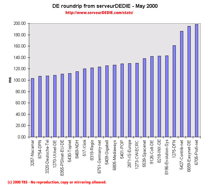 Our roundrip graphic displays the mean roundtrip time in milli-seconds. This graphic should not be read and analysed alone but with the availability chart above. Alone this chart does not mean much.
Nothing noticable.