Description of the data collection process here.
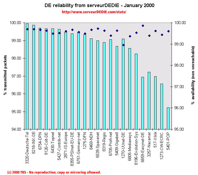 Our reliability graphic displays the percentage of packet loss on the left axis (cyan bars) i.e. 100 - packet loss %. On the right axis (blue points) we display the availability percentage i.e. 100 - unreachable % (unreachable result is attained when none of the 15 probe packets are returned). Therefore the longer the bars and the upper the points, the better.
Globally performance increased in January! We noticed a score increase for Contrib-net, DFN (after bad results in December), Regio, Gigabell, Evolution-Sys and Xlink even if Xlink's performance is still poor.
On the other hand we saw a score decrease for Mediaways, Nacamar, CW-ECRC and POP.
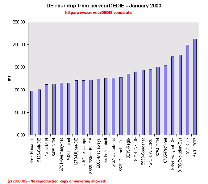 Our roundrip graphic displays the mean roundtrip time in milli-seconds. This graphic should not be read and analysed alone but with the availability chart above. Alone this chart does not mean much.
Nothing noticable.