Description of the data collection process here.
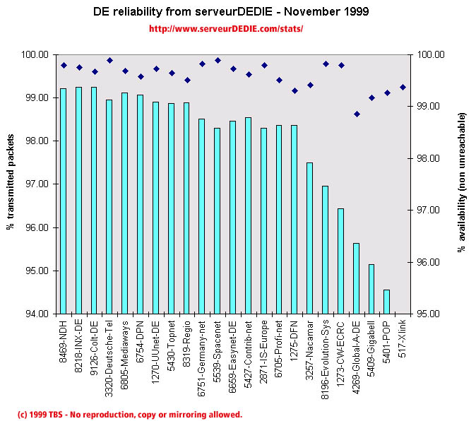 Our reliability graphic displays the percentage of packet loss on the left axis (cyan bars) i.e. 100 - packet loss %. On the right axis (blue points) we display the availability percentage i.e. 100 - unreachable % (unreachable result is attained when none of the 15 probe packets are returned). Therefore the longer the bars and the upper the points, the better.
November results are slightly better than in October! Noticable performance increase: Topnet, Germany-net and DFN. Noticable performance decrease: Xlink, Gigabell and PSInet-EU.
As in most other European countries measured, PSInet-EU gets a bad score with an excessive amount of unreachability. Therefore PSInet-EU-DE is not displayed in the chart reliability chart, because we only display the first 25 best scores.
Colt-DE was added to our measurements.
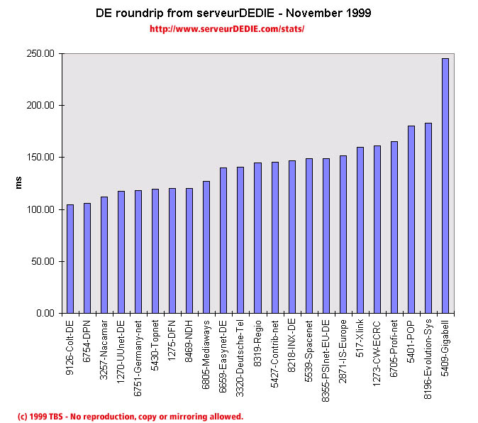 Our roundrip graphic displays the mean roundtrip time in milli-seconds. This graphic should not be read and analysed alone but with the availability chart above. Alone this chart does not mean much.
Nothing special excepted the roundtrip increase of Gigabell.