Description of the data collection process here.
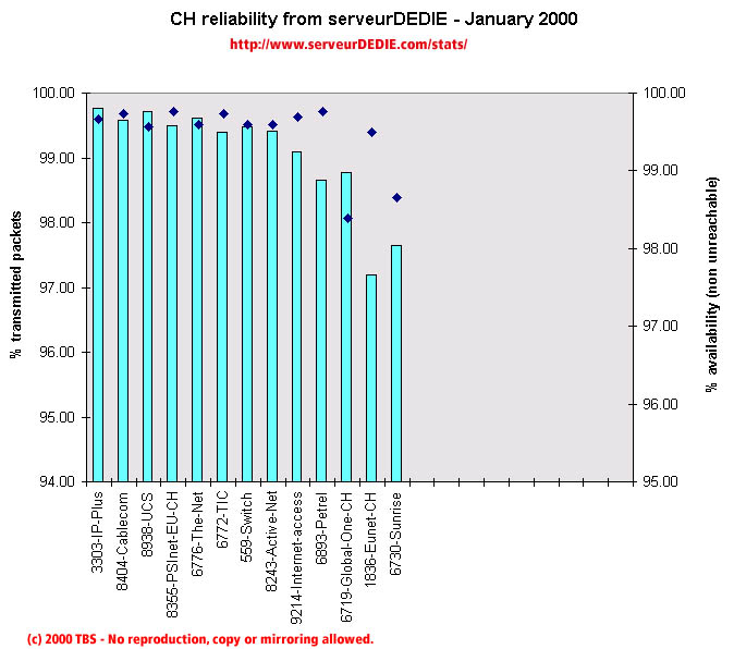 Our reliability graphic displays the percentage of packet loss on the left axis (cyan bars) i.e. 100 - packet loss %. On the right axis (blue points) we display the availability percentage i.e. 100 - unreachable % (unreachable result is attained when none of the 15 probe packets are returned). Therefore the longer the bars and the upper the points, the better.
January 2000 was a better month than December 1999 as far as our results are concerned. We noticed a socre increase for PSInet-EU-CH, The-Net and TIC. On the wrong side of the slope, Internet-Access and Sunrise have a score decrease. We saw a hight level of unavailability for Global-One and Sunrise.
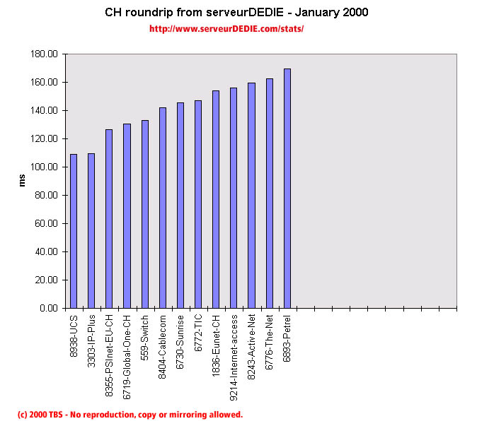 Our roundrip graphic displays the mean roundtrip time in milli-seconds. This graphic should not be read and analysed alone but with the availability chart above. Alone this chart does not mean much.
Nothing special.