Description of the data collection process here.
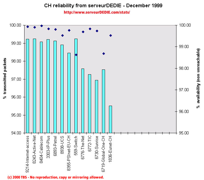 Our reliability graphic displays the percentage of packet loss on the left axis (cyan bars) i.e. 100 - packet loss %. On the right axis (blue points) we display the availability percentage i.e. 100 - unreachable % (unreachable result is attained when none of the 15 probe packets are returned). Therefore the longer the bars and the upper the points, the better.
December was better than November as far as our results are concerned. PSInet-EU-CH gets "normal" results and The-Net (AS6776) enhances noticeably its performances. On the other hand, notice the performance decrease for TIC. We saw a high level of unavailability to Switch.
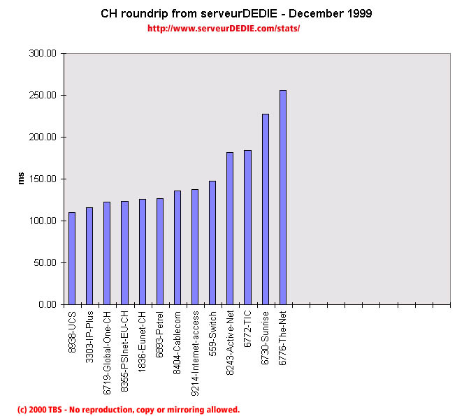 Our roundrip graphic displays the mean roundtrip time in milli-seconds. This graphic should not be read and analysed alone but with the availability chart above. Alone this chart does not mean much.
Nothing special.