Description of the data collection process here.
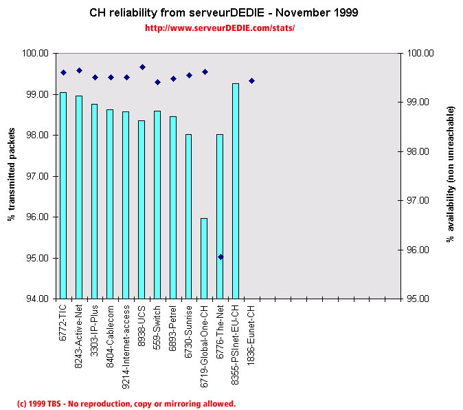 Our reliability graphic displays the percentage of packet loss on the left axis (cyan bars) i.e. 100 - packet loss %. On the right axis (blue points) we display the availability percentage i.e. 100 - unreachable % (unreachable result is attained when none of the 15 probe packets are returned). Therefore the longer the bars and the upper the points, the better.
The November results are not as good as October ones. Main points this month: we measured Eunet-CH packet loss explode, with packet received well below 94%. Such bad results for Eunet were also measured in other European countries, so this is not a problem local to Switzerland. The-Net gets a lower packet loss but has increased unreachability.
As in most other European countries measured, PSInet-EU gets a bad score because of an excessive amount of unreachability. This is despite the packet loss score which is the lowest of this chart (i.e. the best). As you will notice, we consider that it is useless to have low packet loss if availability is low too in our measurements.
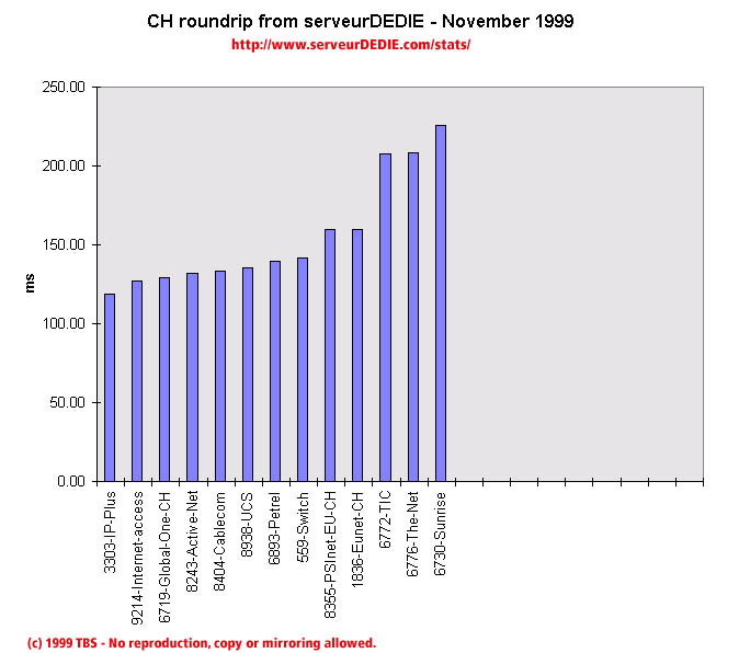 Our roundrip graphic displays the mean roundtrip time in milli-seconds. This graphic should not be read and analysed alone but with the availability chart above. Alone this chart does not mean much.
The mean roundtrip time has notably decreased, especially Internet-access's roundtrip.