Description of the data collection process here.
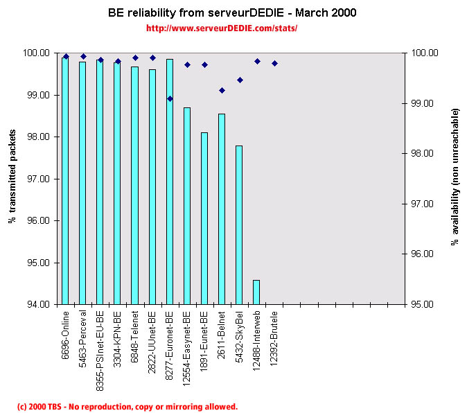 Our reliability graphic displays the percentage of packet loss on the left axis (cyan bars) i.e. 100 - packet loss %. On the right axis (blue points) we display the availability percentage i.e. 100 - unreachable % (unreachable result is attained when none of the 15 probe packets are returned). Therefore the longer the bars and the upper the points, the better.
In March we noted a slight global performance increase. KPN-BE and Telenet enhanced their performance as did Interweb which still gets low results.
On the other hand performance decreased for Easynet-BE, EUnet-BE and SkyBel. Other operators are stable. Brutele's packet loss is so high it does not fit in the graphical chart!
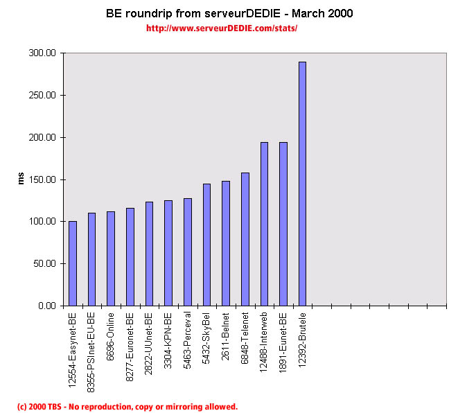 Our roundrip graphic displays the mean roundtrip time in milli-seconds. This graphic should not be read and analysed alone but with the availability chart above. Alone this chart does not mean much.
Brutele's roundtrip is still very high.