Description of the data collection process here.
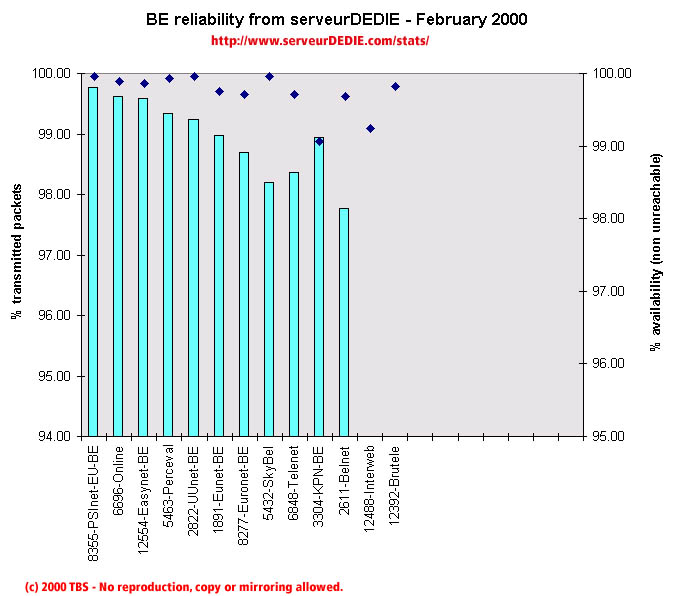 Our reliability graphic displays the percentage of packet loss on the left axis (cyan bars) i.e. 100 - packet loss %. On the right axis (blue points) we display the availability percentage i.e. 100 - unreachable % (unreachable result is attained when none of the 15 probe packets are returned). Therefore the longer the bars and the upper the points, the better.
This month the global performance increased despite two very bas scores.
Interweb was measured having allot of packet loss at certain time periods and ses its performance decline. Brutele maintains its previous months bad performance. Otherwise please note the good performance of PSInet and the performance increase of Easynet and Skybel.
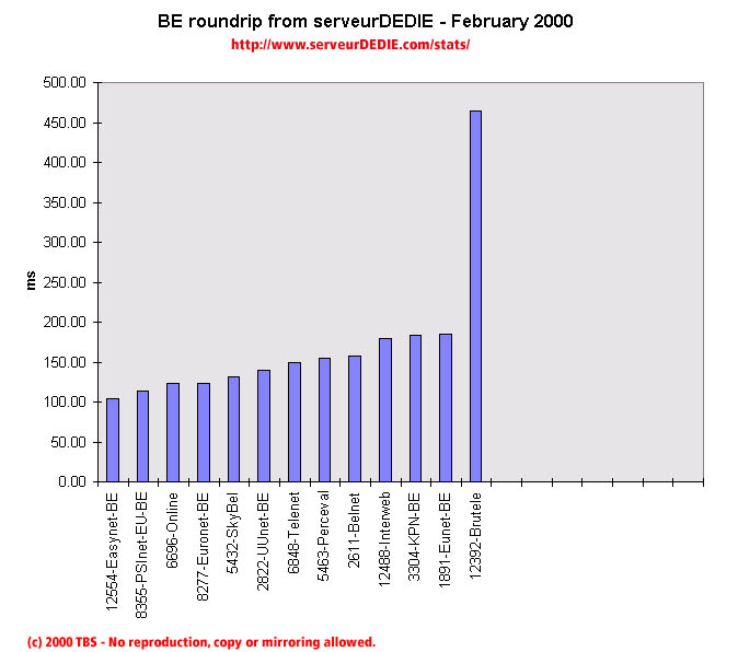 Our roundrip graphic displays the mean roundtrip time in milli-seconds. This graphic should not be read and analysed alone but with the availability chart above. Alone this chart does not mean much.
Brutele's roundtrip has seriously increased :(