Description of the data collection process here.
 Our reliability graphic displays the percentage of packet loss on the left axis (cyan bars) i.e. 100 - packet loss %. On the right axis (blue points) we display the availability percentage i.e. 100 - unreachable % (unreachable result is attained when none of the 15 probe packets are returned). Therefore the longer the bars and the upper the points, the better.
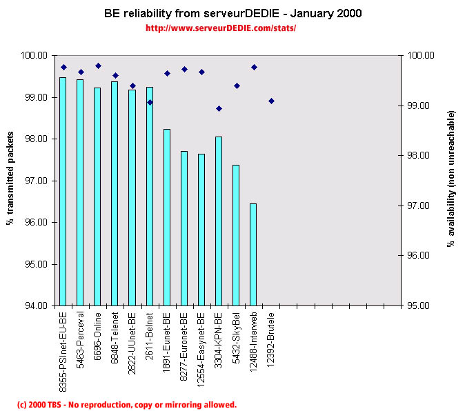
January 2000 gave slightly better results than previous month.
This month we noted the return to better performance for Belnet and Easynet-BE. Brutele also gets a better score but is still far from correct quality. Skybel's performance decreased noticably.
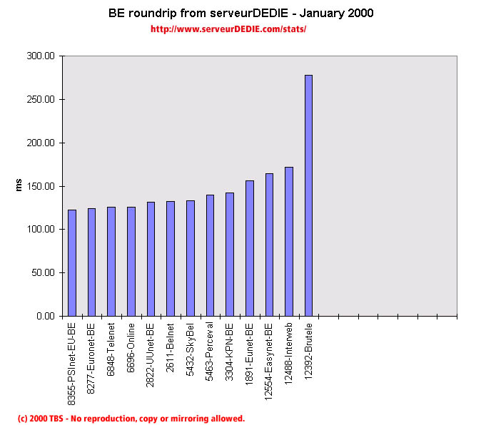 Our roundrip graphic displays the mean roundtrip time in milli-seconds. This graphic should not be read and analysed alone but with the availability chart above. Alone this chart does not mean much.
Nothing special to comment on.