Description of the data collection process here.
 Our reliability graphic displays the percentage of packet loss on the left axis (cyan bars) i.e. 100 - packet loss %. On the right axis (blue points) we display the availability percentage i.e. 100 - unreachable % (unreachable result is attained when none of the 15 probe packets are returned). Therefore the longer the bars and the upper the points, the better.
The December results are much better than the November ones, better too than in October!
Main points this month: KPN-BE and Eunet-BE are back to quality levels much more normal, so does PSInet-EU-Belgium. We also measure a much better score for Skybel, the path has changed and is seems much better.
On the wrong side you should note the bad score of Brutele, and the availability problems we noticed with Belnet.
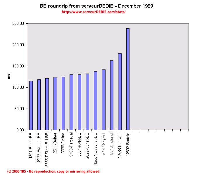 Our roundrip graphic displays the mean roundtrip time in milli-seconds. This graphic should not be read and analysed alone but with the availability chart above. Alone this chart does not mean much.
Nothing special to comment on.